
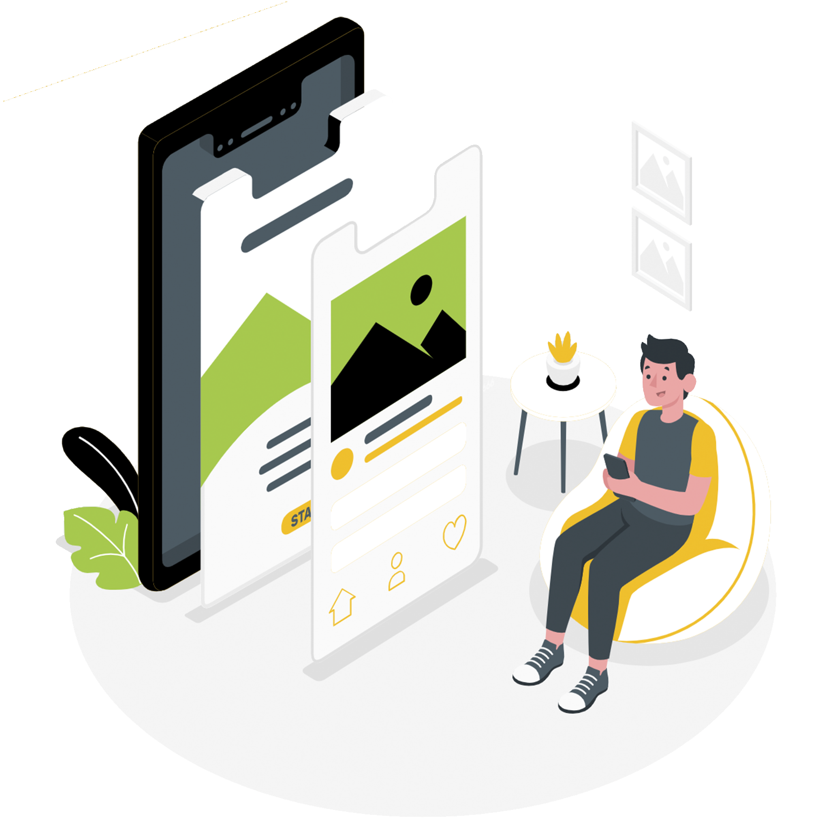
Having a Mobile-First designed website is critical to growing your online business, as more than 60% of web traffic comes from mobile devices and almost all users prefer a mobile-optimized site.
As per the latest Google Mobile First algorithm update, user experience on mobile devices is now one of the most important ranking factors. All of Smart Site Designs meet Google's guidelines and outperform most website builders.
Mobile users generate most business leads and sales. Your website needs to be a Conversion-Driving Website, delivering a superior user experience that converts potential clients into paying customers.
Why Does Mobile-First Design Really Matter?
Most website builders are desktop-first, but over 60% of online traffic now comes from mobile devices.
To meet this demand, use Green Lotus Smart Site Builder for a touch-friendly, visually stunning mobile website that increases engagement and sales.
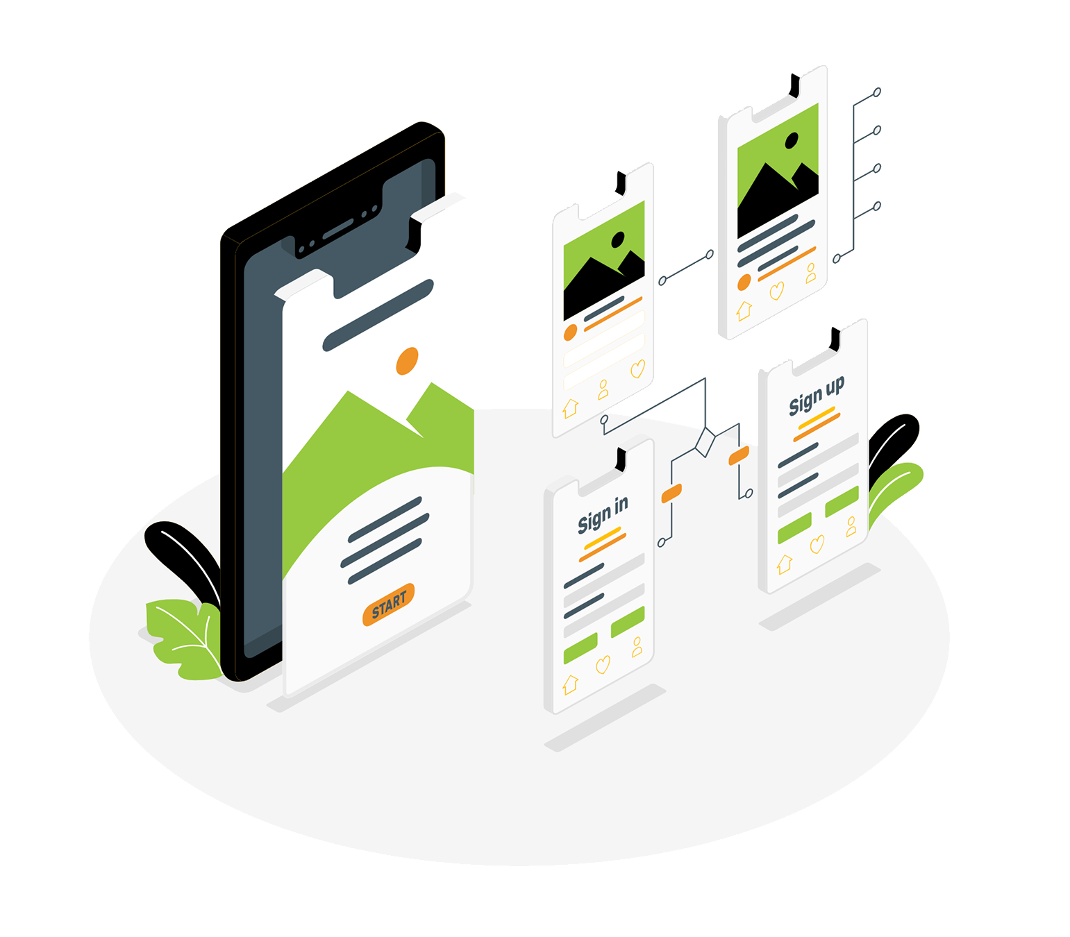
Business Driving Mobile First Features
Click-to-Call
Make it easy for your mobile customers to get in touch with you by providing a one-click.
Mobile Maps
Make it simple for customers to find your business location using their mobile device.
Thumb-Friendly
Make your website easily navigable with just a swipe of a finger or thumb.
Simplify Navigation
User-friendly site menu for easy website navigation on mobile devices.
Clear Text
Mobile users no longer need to zoom or pinch to read your website.
Easy Convert
Make it easy for mobile users to navigate and engage with your business.
Restaurant Menus
Own a restaurant? Format your menu for mobile screens so diners can check it out before coming in to eat.
Business Hours
Customers must know your business hours. Add them to your site for mobile users.